You might have read that Firefox is getting a new default theme. Here’s a first look. I’ll post more about the making of the theme in the next few days.
Edit: I appreciate all feedback, negative as well as positive, but please reserve final judgement until you have actually used the theme 🙂
Click on the image to enlarge.
This is certainly not a bad looking theme, but IMHO it lacks the quality of Qute. I don’t know why exactly, but the old default theme ‘just felt right’, for me, as an experienced user, and for many others who were being freshly converted from IE.
In my opinion, adding this theme to the standard Firefox themes-list would be a good idea, if only to advertise the theming options of Firefox, and to give users an easy choice from the start. But I am pretty confident that Qute appeals to a much broader audience, which should be the primary selection criterion for the Firefox developers.
Personally, I don’t like the Luna-feeling of this new theme, but that could have something to do with the fact that I don’t like Luna. 😉 In my opinion, Qute looks as good in ‘Windows classic’ as in Luna – I wonder how this new theme will fare in the classic look.
Is this a joke or are the drivers trying to stop people using the official builds?
I really like the new theme. It’s much less of a direct IE-ripoff than Qute, and seems like an appealing mix of Aqua, BlueCurve, and Luna. Thankfully less Luna influence than the other two, though. Excellent work! I think I’m actually going to use the default theme for once.
I’m all for replacing Qute with another theme, but it should not be this one. In comparison with the OSX version of Pinstripe, this lacks depth.
While I appreciate the need for clear icons, that does not mean that there is no potential for artistic flair. To be frank, these icons do not have that flair. They lack personality.
The new application icon for Firefox was excellent – vibrant and recognisable. I’m sorry to say that this theme appears to be exactly opposite – bland and without that je ne sais quois which makes a theme special.
I’m not suggesting that Qute be the default, but it would be better than this watered down alternative. Sorry.
Having said all that, I realise this is a work in progress – I have faith that the comments we all make can be addressed.
There’s potential here, I just hope you realise it.
Why don’t they just use a better and already complete theme instead of remaking from scratch?
Like, Phoenity, http://phoenity.com/, the best theme as far as I know. Throw Qute and *sripe away! They’re all similiar to some OS… It’s a shame and may be sue by Microsoft or Apple if they do want to play with you…
The new default theme is a little bland. It’s not really offensive but it also doesn’t inspire me to really use the program either. Also, as has been said before, it is too luna-centric. I don’t know anyone that still actually uses the hideous blue borders instead of switching to the silver theme. You might want to consider getting rid of the mini-luna window seperator icon and any others that look like luna windows. Hopefully this theme will get better before 1.0 is released. As it stands right now, it’s just not good.
No offense intended, but Phoenity is UGLY. Really, really ugly. It’s great that you like it, but Phoenity’s just not default-theme caliber. The lines are far too thick and round, and it looks like a bad mockery of Luna.
Though I don’t especially like what I’m seeing here, I daresay it will grow on us–personally, I didn’t like Qute all that much when it first became the default, either.
I think the reload button is distinctly ugly because of the shape of the arrows. The rest is just boring, plain…but that’s probably how it ought to be.
I would prefer that Firebird look like my OS than look like some weird graphical mess. The proper place for “skinning” is in the local UI toolkit, not in the application.
This theme seems to fit quite well into the “groovy, funky” Windows XP interface, but does it behave properly in “Classic” Windows?
If it does, then I think that this is a nice theme — simple and clear. If it’s still going to look like Windows XP when used on other systems then it is broken.
I think its ok, but defintely a step backwards. I really dont like the refresh and home buttons 🙁
This theme is much much cleaner and easier on the eyes than Qute. Qute was wierd with its 3D’ness which made the screeen look tilted. Also, Qute looked over optimized in areas and way ugly in others.
My only problem with this theme is that Home button is weird looking. Also, the Back/Forward would look better if it looked like an arrow
/
/-
\
\
somethine like that
I must say I’m very surprised by this turn of events. I was under the impression that Qute (which I personally consider the finest, most polished Windows/Linux theme out there) had been chosen as default and would remain so. What does Arvid have to say about this?
Having said that, I think the Pinstripe theme you and Steven produced for Mac is excellant, just as good as Qute but aimed at a differently styled platform, so I have every confidence that this theme will turn out just as good.
Well then, feedback… I won’t say much at this stage as clearly the theme is a long way off completion – the icons are flat and uninspiring and the colour scheme is, well, a little lurid. The icons appear to take up very little of the spacs available for them and this looks a little odd. Also, how does it look on a Win 9x machine?
I await developments with interest.
Neil
Really poor! Is this a joke??? Bland, ugly, and looks like IE.
I love thie theme! Where can I get it?
Not sure if I like this new theme. Definitely needs work and changes before I make a solid opinion.
This also does not look very Pinstripe like to me. The excuse of wanting a theme that was similar between platforms isn’t a good one when you compare this and the Pinstripe used on the Mac.
In and of itself, this isn’t a bad theme. Compared to Qute, I’d still go with Qute.
I am a cross-platform user. I need a theme that looks good across OSes, so that when I’m at home using FreeBSD or somewhere else forced to use Windows, I can use FireFox and feel at-home. Also, I recognize the need to a default theme that provides definite character and originality to an application such as FireFox where there’s a huge effort to get it to be chosen over the current Goliath. I don’t feel this new theme accomplishes that. Meanwhile, I believe that Qute was one of the best things that ever happened to FireFox to help its PR effort.
Yeah, we are definitely going to get the IEPC-crossover crowd with a bastardized-OSX icon set!
Well, the theme looks better implemented in practice, in screenshots, than it seemed based on the pictures of the buttons alone, in isolation. It makes me feel better than what I was seeing on Slashdot. Not only does it seem better than what I was thinking it would be, it seems more consistent with what I might imagine Firefox to look like.
Having said that, I have a few comments:
1. I think the buttons should maybe be a bit smaller, relatively speaking. They should be less prominent in general.
2. The button images need more depth. For example, I think that they could use some “softening”, so that the edges of the button images seem more “warm”, for lack of a better term. Another possiblity is to emphasize the 3d character with shading, orientation, or something. Yet another possibility is to “crystalize” them, making them seem more transparent or glazed.
3. I generally like the buttons. Some, however, I really do not like, like the “stop” button. Keeping with the “softening” suggestion, I would prefer to see a rounded, rather than octagonal button with sharp corners and lines. Maybe the softening of the edges would help. I also think some of the other buttons might look better if they were made more “iconic”, with less detail, like the new window button, or what ever it is on the forums screenshot.
In general, it’s a pleasant theme, but could use some improvement
I think the new theme definitely could be great (not quite there yet, but this is a work in progress from what I gathered). My only reservation, and this is a BIG ONE, is that the octagonal stop sign will have little meaning for any country other than the US. As Mozilla and Firefox constantly stress portability, I think going with a US centric stop sign is not the best move. Other than that though, good work!
look guys,
I don’t personally frequent the mozilla developer list, or even the style list, but my suggestion would be DUMP THIS THEME AND STICK WITH QUTE.
Sheesh. I get a theme for a non-IE browser on windows XP that I can get regular Windows-XP users to get excited about, probably the best thing that could have happened to the browser since its beginning, and I read that the first thing people are thinking of doing is replacing it.
Look past your personal preferences and think of the users. Please! No offense, but you can tell this design wasn’t done by someone who had Windows in mind – its not bad in itself, but with this skin, the app looks way out of place on a windows desktop.
So please… solve the licensing issues with qute, and go ahead rather than take this huge step back.
Each image should fill up as more of its vertical and horizonal space in the button. Since there is no unclickable space on buttons, the white (gray?) space around the icon should be kept to a minimum. Even though the whole button is technically the target, to the end user only the image is the target. Keep the target big. The current images are closer to the size that “small icons” should be.
I think the home and mail button are a little too flat in perspective. Any icon that depicts an actual object (house, envelope, printer) should have a slight 3D perspective to make the object look “real.” The more intangible buttons (e.g. arrows) are fine in a flat perspective.
Do yourself a favor and make the latest version available to the public. Screenshots area not doing it justice if in fact it is a good looking theme.
Everybody’s a critic today.
This has a lot of potential. Keep up the good work!
Kevin, I see a lot of negative feedback here, which is a shame. Everyone has their own idea of what makes a good browser theme, and it will never be the same idea.
This is my idea of a good theme – Qute looked unprofessional to me.
Thanks for the comments everyone. Remember the theme hasn’t been released yet. We’re working hard to get this theme into your hands and I look forward to reading your thoughtful comments after you have had a few days to use it 🙂
The “reload/refresh” button doesn’t have the correct “circular feel”, it’s a but on the chubby side 🙂
I think both themes have their strong points, and Im sure that in time this will look as nice as qute.
The sad part here is really not the actual theme but the way Ben & co. have handled this. Once again Ben is out driving his no-information, I know it all steamroller 🙁
This is most likely no fault of kevin, so therefore keep up the good work kevin,
Hmm. Good points: clear, simplistic, logical, uncluttered. But it does look very, very bland and unimaginative. Like someone already said, the new icon/logo for Firefox is brilliant: vivid and lively. This has neither of those qualities.
Jon Hicks: the Qute style was a feature, not a bug. WinXP looks like unprofessional trash…Qute is the best your going to get when the artist was going for a WinXP native look. Yes, WinXP looks like trash…but Firefox should blend in with that trash so it can get the average windows user.
Everything is good with exception to the stop and home buttons. UGLY! Also round and shade the address bar and search bar. Everyone knows a rectangle is similar to a box, and we want to think outside of the box microsoft puts us in…
this one looks nice, but i dont like the reload icon (looks too different from the rest), and the stop icon (looks like a warning icon)
You’re fired!
Really… What decade are you making icons for?
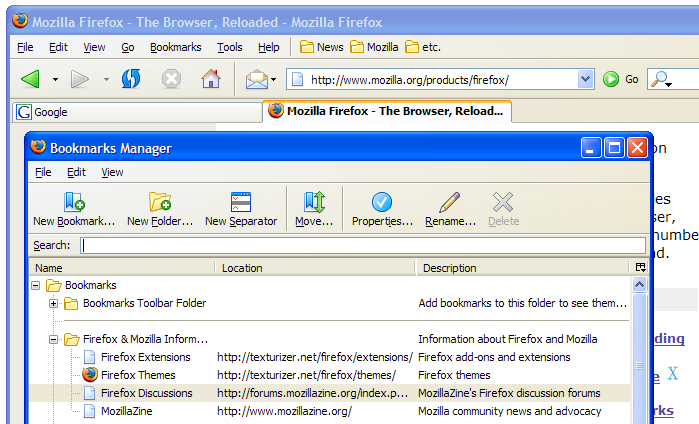
There’s a big difference in detail level between the bookmark manager icons and the standard toolbar icons. The toolbar icons seem very unrefined and quickly drafted compared to the bookmark manager’s ones.
Having said that, how is it that people can make the most beautiful, rich and detailed icons for OSX and the various Linux shells, but Windows has to make due with these flat things?
Which is the operative word, by the way: flat. Not enough graphical skill has gone into this, not nearly as much as the application icons, in any case.
And I’m all for rounding up the Stop button. It’s an icon, not Pixel Art.
This theme looks good, but I feel that the main navigation buttons lack the 3D feel and colorfulness that quite has.
The bookmark manager buttons look excellent, though!
This is good news! The basic idea – having the same icons adapted/styled for every supported OS – is fantasic. Not easy to do but I count on you Kevin!
I’m curious how the gnomestripe theme will look like…
(I will not comment the way this decision was handled since it’s not relevant in this blog, but obviously that was the biggest mistake by mozilla.org this time around.)
Jon Hicks, it would be very interesting to hear what you find unprofessional about Qute. Do you also find the native graphics in Windows XP unprofessional, since they look so similar? Look at the icon for Calculator, Notepad, or Windows Movie Maker. Do they look unprofessional? Or do they blend in with the OS they’re intended for?
Why trying to make a MacOS X inspired theme fit on all platforms? Because the Visual Identity team use Macintosh computers? I thought we were primarily targetting Windows users here. Based on last month’s web stats for Firefox Help, 83.32% of the visitors are using Windows and 2.86% are using Macintosh.
Kevin, with all due respect, your MacOS theme is perfect for… MacOS. It even has the 90 degrees flat drop shadow that is so typical for MacOS toolbars. It is indeed an excellent MacOS theme, but it has no place in the Windows (Luna/Classic) interface (strictly my opinion, of course).
Firefox (and any official Mozilla.org product) should try to blend in with the OS they’re being run on, and not attempt to use a poor cross-platform appearance that SeaMonkey did.
Anyway, if we really are going to use a MacOS inspired theme for all platforms and in this particular case try to make it look native for Windows XP (with Winstripe), then here are my suggestions:
1. Use more rounded shapes
This is the most apparent weakness of Winstripe at its current state. For example, the Home icon looks really strict and dull compared to the inviting Home icon of Internet Explorer, or Qute. Look at the icons in the Windows XP start menu. None of them have hard edges. All of them use soft, smooth, cute looking shapes, such as the Calculator icon mentioned above.
2. Use gradients
This is being used in Winstripe already, to some extent. But the icons still look as if they were designed pixel by pixel, unlike the native Windows XP artwork which look like scaled vector graphics, and as such, much softer.
3. Use more depth
Windows icons should not be flat anymore. They were in Windows 3.1 and 95. They still were flat to some extent in Windows 98/Me/2000, but in Windows XP, which should be the primary target, the icons have a 3D-looking appearance.
3. Don’t use a vertical drop shadow
This is just not the convention on Windows XP. I’ve never seen it used before and it actually looks strange.
4. Use the same width for all icons
The Mail & News icon is wider than the other icons. The Back/Forward triangles appears to be wider than the Reload icon. I could probably come up with more examples, but the end result is inconsistency. It just doesn’t look balanced.
5. Blend in and look modern 🙂
This is a vague suggestion, I know. The current Winstripe theme just doesn’t attract me. Try to look cool and modern, try new ideas, drop the scrictness, try to make an impression. I can’t express it better, the Winstripe theme is just too squarish, flat and strict. The default theme should be inviting, the buttons should encourage the user to click on them.
I hope this feedback is of any use and that I managed to be specific enough about the current flaws of Winstripe. I’m confident that this can turn out to be a great theme. Personally, however, I much prefer Qute since it already is a perfect fit for Windows XP.
Good luck Kevin and Stephen and keep up the great work!
Not bad, as it is still in development. Like many, I have grown fond of Qute, but I understand if there needs to be a change, and this is a good start. My constructive criticism for this theme would be that the main button toolbar on the browser window is far too tall. There is far too much space above and below the buttons. I’d like to see theme makers conserve space on the toolbars to allow more of a document to be shown at a time. I would also have to say that I am not a big fan of the forward and back arrows. I like the traditional arrow look more than the triangle look.
I’m writing up something more comprehensive, but I’ll say for now my thoughts echo those of David Tenser. Look for a Trackback from me sometime in the next several hours with some thoughts on Winstripe. (David, have you been reading what I think you’ve been reading? I’ll hit upon that possible common source in my Trackback.)
Well i gotta say i quite like it, i think it looks very sharp and professional.
I see what Jon Hicks was saying about qute, it has a soft, cartoon-like feel to it.
either way there both very nice themes, a hell of a lot better than I could do…
I can’t believe there’s so much backlash about this theme. It’s a high quality theme that does exactly what it’s supposed to do. Jon Hicks fabulous application icon is one thing — some degree of flash is appropriate there. But the toolbar icons should be obvious to their purpose and attractive without being distracting. This theme fulfills those requirements much better than the Qute theme and is much more professional-looking. Keep up the good work guys.
I rather like the new Winstripe look. Very streamline, while very clear. A step forward, methinks. 🙂
silentj:
If being cartoon-like is the same as having “fun, color, and energy”, then I’d say Qute did its job perfectly – those are the exact words from MSDN’s document on the Windows XP icon style (the document I referred to a few comments above, David – a link can be found in my post named below).
I’ve also posted a fuller response to Kevin’s base post at http://s95135199.onlinehome.us/2004/06/06/winstripe/ with a Trackback to here.
While Winstripe is new and will need lots of refinement, if the looks of Pinstripe are any indication, Kevin and company know what they’re doing. That said I have one major complaint about Pinstripe and now with Winstripe…
I feel that the set of “Large” icons is too small. I don’t know why people tend towards such small icons but although they save screen real estate, most of us can spare that little bit in return for buttons that are easier to hit with the mouse cursor. I really think that the “Large” icons in the XXXstripe themes should be made a bit larger and they should definitely have consistent widths, which is another major problem.
Thanks for listening and thanks for your hard work.
One other thing:
Kevin, as you’re making a new default theme for Firefox on Windows, can you take a look at the theming of the sidebar in Firefox Help (the component, not the site)? It looks like it came out of Netscape, and it’s old and ugly as anything.
I’ve been meaning to file a bug for this on the firebirdhelp site on Mozdev, but it’s never been a huge priority.
Finally, regardless of the opinions of anyone else, I *do* want Winstripe to be good – I just don’t particularly enjoy it in its current state of un-Windows-ness. Keep up the work on Winstripe (particularly in the Windows-ization process – see my blog post on y0? for some possible guidelines from Microsoft itself on the icon style), and hopefully by the end most people will have at the very least accepted the fact that Qute is gone.
Qute is ugly 😛
It looks “choppy” in default size(small).
Plus, it’s 3D perspective is retarded.
What’s up with Reload/Stop buttons?
I think Winstripe has the right concept.
2D and simple, although some of the icons aren’t so hot.
I think you should rotate Reload on its side so it looks “standard”
And the folder icons used in New Folder and bookmark folders looks rather choppy.
Certain elements are too Mac-ish, like New Bookmark, Move, Properties.
I also like Qute’s new seperator icon.
The home icon looks faded…
Lastly, there is too much lighting for Go button
two things
a) the “new separator” icon shouldnt be featuring the default luna windows borders look … and the icon should have this (+) circle like the the other addition buttons
b) I’m not so sure the idea of a shadow with the back, foward, refresh, stop buttons is appropriate … make it on every icon, or simply remove it (I would go for the second option)
one part that didnt receive as much love as the rest in the qute theme was the bookmark manager, try not to fall in this trap too (of course we dont see those icons as often as the main window ones, but just for the sake of overall pro. work, it would be good 🙂 )
(speaking of that, I dream of the day where I will be able to remove the texts under the icons in the manage bookmarks dialog … ahhh)
In my opinion:
Way too much empty space between icons.
The drop shadow should go.
The back/forward buttons are too big in comparison to the other buttons.
I don’t much like the stop icon, perhaps if you rounded it out?
At this point in the development process I’d say Qute is still a better theme.
Dear God, that is a step back.
Lemme tell you something. First impressions count, and that theme is really gonna make potential users just look at Firefox and think, “I thought this was a new browser.” Most people keep the default theme. I really mean this. Most don’t skin their browser because either they hate to deal with skins that could be buggy, they like things simple, they like the default theme, or they just don’t know or don’t care about skinning. This theme will be all over the review sites as a definite step back in the Firefox team’s plan to make people use this browser. I’m serious, and people will be turned off by this theme unless it gets a serious rehashing. This thing looks like something from the year 1996. It’s 2004. We need something that looks unique and has some serious depth to it. I didn’t think Qute was all that great, but this is seriously just nostalgic looking. Mac users wouldn’t stand for something like this on their OSX, why do the WinXP users have to get this? Back to the drawing board.
Hua 🙂
@end firefox!!!1111oneone
Yuck. If you are going to build a *DEFAULT* theme targeting an operating system, perhaps you should first READ THE GUIDE. Microsoft went through great lengths to create a consistent interface in Windows XP, and if the goal is to convert J6P users rather than geeks, it MUST fit in and look just as good, if not better, than Pinstrip does under OSX. PLEASE read the guide and adjust the palette, perspective, etc. accordingly, otherwise I’ll have a MUCH harder time selling friends and family on Firefox unless I physically install it so I can grab Qute and let them have something that actually looks like it fits in with the rest of the OS. Link:
http://msdn.microsoft.com/library/default.asp?url=/library/en-us/dnwxp/html/winxpicons.asp
Sorry for the flame here, but this whole thing has me pissed. Interface aesthetics are incredibly important. I even use the above guide when developing web applications so they are consistent with the non-web environment, and I would expect anyone working on a professional project (even an OSS one as a hobby) should educate themselves about how to accommodate the audience.
This theme would be a nice addition to Firefox if the switching over wasn’t so badly handled by the team.
I mean, informing Arvid about the switch at such a late time, also keeping the change “hidden” for all the community ? What were they thinking.
I have defended the “closed group” policy of this project before, but this is a bit too much really.
this thing doesn’t look like Mac OS X at all. it’s got all the bright hues of Luna… you’ve got the visual identity right, just rid the Lunatic hues!
Thank you, Kevin, for your great work! It looks awesome, although the home and mail buttons could be a little bit more “3D-ish”, otherwise the main toolbar would be too flat. I hope Ben will activate this new checkin, soon.
Bravo.
Not being a fan of ms winXP, this theme is going in the right direction.
Simplicity, clarity, elegance, it gives me a more streamlined, quieter visual impression and certainly more willingness to adopt Firefox as my primary browser.
Qute wasn’t bad but definitely too blatant and intrusive for a day to day use.
Keep up that line of design, we need this.
I really like it…. I am suprised by how negative the feedback is.
The negative feedback isn’t so much because we think that it’s a bad theme. Just that it doesn’t fit with the look of WindowsXP and is likely to turn new users off.
I have always stuck with the default theme in Firefox, but this is too much for me and I won’t install any new Firefox versions until I can install Qute as a theme. I’ll also probably stop testing the nightlies as it’s too annoying to keep having to install a theme with every build.
To reiterate. This theme would be fine as an option, but as a default I find it unacceptably different to the rest of the WinXP look and far too outdated.
Well this theme wouldn’t fit in my “all classic style” XP. Would stay with QUTE. Perhaps insert a selection at first start – “Classic” or “native XP-Style” -Theme.
This new theme is shit!!! down with pinstripe!!!!
anything.. man you couldnt make a theme if your life depended on it
YoU aRe StUpId.. This theme, sucks.
QUTE!!!$EVA
Ben Goodger is a faggot and so are u
LOL
Instead of deleting the last couple of comments, I’m leaving them as an example of THE WRONG WAY TO RESPOND to this blog post. Please be civil.
Appearently lots of people dislike this new theme.
Why don’t you set a vote up somewhere and let the users decide?
Please read the guide.
http://msdn.microsoft.com/library/default.asp?url=/library/en-us/dnwxp/html/winxpicons.asp
It doesn’t matter if you like it – it only matters that the application look native on all OS’s.
Please forget the dream of having Firefox look the same across multiple platforms. Applications that look different from the OS are ugly. On Windows Netscape is ugly, Mozilla is ugly, Qute is good – not great, but it’s palatable.
Themes are there to let people who want a look that’s different from the OS to get one. Not to provide a way to get the default OS look when the designers decide they want their application to look different.
If this is going to be the default theme, then you absolutely need to make others available at install – because after that people will be turned off by it enough that they’ll uninstall it before trying a different theme.
I do not like how the home-icon looks. I can not tell why, but it just does not look right. The reload also seems a bit strange. I guess it somehow needs more depth to give it a more plastically look.
Pinstripe looks cute – on OS X. On Windows (especially XP with its Luna Theme) Qute fits better, since it uses similar 3d effects. The Winstripe buttons are too two-dimensional.
Browsing should be fun – and Qute incorporates this best. A way out would be to ship the windows version of Firefox with both, Qute and Winstripe).
Here’s my tuppence worth: I’m a huge fan of the Pinstripe theme, and currently have it on both TB and FF. It is the first theme I’ve seen that is both distinctive and sufficiently professional enough to give Mozilla a place in the market.
I have never personally liked the Qute theme, but do admit that it is an extremely well designed and consistent theme.
Views on ‘Winstripe’: well, I’m obviously happy with whatever is a hand over from Pinstripe. The Pinstripe icons are coherent, consistent, and self-explanatory — history and bookmarks are particularly to be praised as examples of icon design. HOWEVER, the new Back, Forward, Stop and Home buttons are simply dreadful. Their monotone, flat design clashes with the texture of the other icons. Now, there may be a rationale for this: these are the main and likely default buttons to be used during browsing. However, at present they simply ruin the toolbar eyeline and distract the browsing experience.
Kevin and Stephen: make these icons consistent with the others, and you have a happy defender of a theme with potential!
This doesn’t look clean, instead looks awkward. There certainly too much space between icons and icons itself doesn’t gel well. Just visualise the first 5 icons.
Look at Smoke, Pixelzille, Neptune, Nautical …..
All of the icons have good designs, except Home, New Separator.
Shadows under icons are unheard of here.
Maybe you should rotate Reload on the other side.
Back/Forward are a little weird…
Coloring of icons isn’t great(Go button, Home)
This is has lots of potential once weird icons are fixed and color is more professional.
Interesting. I don’t think the Qute theme blends at all with WinXP. This theme looks much more XP’ish.
What, I don’t see any OSX here! Get a grip people, you need more than alphablending to look like OSX…
http://homepage.ntlworld.com/jessica.davis/fb/0.9/classic.jar
Download and replace your current classic.jar in the Firefox chrome folder.
==================================================
Now that I have it, my feed back
*Home is fugly with the little shade falling down roog(plus its purple???!!!)
*Wouldn’t it be cool if throbber had some Firefox in it? While it’s spinnig around, the thing could alternate orange, yellow, red
*Qute was fugly, but it was super fugly with icons and text. Icons and Text in Winstripe is perfect, like IE6.
*There sure is a lot of spacing between icons…
*When you hover over mini back/forward triangles, they don’t have an outline, which was a problem in Qute also, but since you’re more dedicated, maybe you can fix
*While Mac-heads are used to that Bookmark icon, I think it should be a Star/Heart since it’s not very obvious. Plus that icon doesn’t match with Back/Forward/Reload/Stop’s simpleness
*New Window icon looks like a minimized real window. You should remove toolbar in it and exaggerate it.
*Go button has too much lighting so white part of it mixes in with light.
*Whats up with the shadows under the icons? If light is facing top-left, then why is Forward’s shadow different?
*I don’t agree with others who say Stop is obnoxious, but being that lots of foreigners use Firefox and hate my wonderful country America, you
should probably use something less offensive
*New Tab shouldn’t have little box thing under it.
*Maybe it’s just me, but the little green + icon is really small in New Tab/Window/Folder/Bookmark. Also, why is green+ in middle right of New Tab/Window but in bottom right of Bookmark/Folder?
*Downloads icon looks like a calculator.
*The Options icons are WAY too Mac
*New Separator is too weird.Qute’s was better
*The folders used in Bookmarks are too shiny and remind me of Phoenity. You should just rip XP’s or Qute’s.
*That little thing on top of the paper in Print is weird
Just installed Firefox with the new theme and, well… It has potential.
Things that I noticed:
1) When you always have one tab visible, and open and new tab in the background, the current one will move down som pixels. It would be great if this could be avoided.
2) The icon for flexible space and the one for regular space are identical, you cant tell the difference. Would be nice to have it like Arvids Qute had it. This make it easer to understand for new users.
3) An issue that also Qute had, when hovering the little black arrow to the back and forward button, the hover effect is wrong. The separator only appears when hovering the forward/back button. This is worse on windows 2000 and XP with classic look, where no hover effect will be shown when hovering the little arrow.
Apart from that, as stated before, the icons doesnt really blend in with XP, but I guess/hope that they will improve.
Looking forward to see updates on this theme.
Whats that? What was wrong with the old theme? I don’t get it.
I don’t like the new theme. I don’t agree, that Mozilla stuff has not informed the users, that a new default theme is planed.
The theme looks primitive. The buttons looks like a duplication of Internet Explorer, not like Firefox.
Really bad times. 🙁
I wouldnt say this theme is not good, but its just not good enough to be another default theme, I respect your work, and I love the icons for FF and TB, but this theme looks so uncomfortable in winXP environment. And I dont understand why you guys didnt make any communication with the author of Qute theme when this project began?
I couldnt think out any detailed suggestion about how to improve this theme, since the feeling of not right is not in some specific part, but in the whole feeling.
Anyway, if you guys decide to use this one as default theme, try get more feedback and improve it more. and good luck.
What’s wrong with the old theme is that Creator of Qute didn’t want to open his license or some other legal mumbo-jumbo. The point of opening the license I think is so others could take his work and improve it, but he didn’t want too. He says he wants is now… but he didn’t before, and it wouldn’t be right to force him.
I actually think the duplication of IE is a good thing since lots of people say Winstripe looks nothing like IE.
Edit: I appreciate all feedback, negative as well as positive, but please reserve final judgement until you have actually used the theme 🙂
Can you make an installible version based on http://homepage.ntlworld.com/jessica.davis/fb/0.9/classic.jar
so people can stop the sometimes retarded comments?
sorry, this is just a huge step backwards. the icons are just plain boring. they have no depth and are spaced too far apart, the colors are bland and it doesn’t seem like a coherent theme like Qute was, or integrate well with the browser’s existing UI (windows, etc.). all reasons i never liked pinstripe on the mac version.
it would look fine as an initial draft, but with this being 0.9 coming up and 0.1 in a few months, you should be able to see why UI work is an art and not something that can be whipped up (or implemented) so late in the game.
I’ve tried this theme, and I am not going to compare it to Qute (like some people) as that won’t help anyone but here are some thoughts:
#The New tab button looks to me at glance like a printer icon (maybe it’s just me); when compared to the printer icon the outline looks identical
#The download icon (the small one mostly) that opens the download manager dosn’t look right… Maybe just an arrow would look better
#Now I am getting really picky but I don’t like the home icon, perhaps i’m just used to the different perspective, or it could just be the fact that it’s PURPLE.
#Again this just my opinion but the mouseovers don’t look prominate enough
Other than that the theme does look very good and well made
One Q though and I don’t know if this has already been discussed- Will the original artwork to this theme (a .PSD or whatever they were made in) ever be realeased? I think it would be great for devopers if it was.
“Microsoft went through great lengths to create a consistent interface in Windows XP”
Good one… you must be kidding, right? xp is like, 5 different file selectors in major apps, different icon themes/styles… windows is nowhere near consistency
Thoughts as they arise:
– It doesn’t look as good as Qute
– Everything looks 2D, which doesn’t blend in with the OS (Luna)
– The “large” icons are too small
– The 2D-ness makes the icons harder to distinguish (yup, not easier)
– New Tab *does* look like a printer
– The arrows on Copy and Paste aren’t required – Copy is always simply two sheets of paper; Paste is always a clipboard and a sheet of paper
– I do prefer the (revolutionary) idea of making Bookmarks look like a bookmark – I don’t know why it was ever a star
– Help’s Test Size icons are OK, but could be confused with Search
– The Close Tab button doesn’t match Luna’s red button as well as Qute’s did (i.e. looks out of place)
– In fact, every icon looks out of place
– The symbols chosen for the icons are mostly good; the renderings of them are amateurish – too pixelly
– I like the throbber
– The Download, Extension and Theme Managers look bare without a background image
– The JS console needs icons
– I’m going back to 0.8.
First of all, the guy above is silly to go back to 0.8 as Qute can be themed in later.
-we need 3d depth to the icons as that what fits with the luna XP set.
-new tab button looks like a printer, seriously
-stop with the solid colors, have some variation
-the home button just SCREAMS IE 5.0
-back/forward buttons…what the heck? equilateral triangles? Even the most novice themers know that to get users, u have to be more creative than this
-thank god u left the throbber on
-drop shadow for the back/forward buttons is a cheap shot, if you don’t have 3d buttons, don’t make shadows, seriously.
-this needs MAJOR reworking. For the first time in my use of Firefox, you are forcing me to use a theme. The point of having a default theme is to make it nice enough so a good proportion of its users will be happy with the default look. Most people don’t like this. I even believe that Ben Goodger dislikes this. Back to the drawing board.
First that came to my mind using Winstripe for few hours: The downward pointing arrow indicating a dropdown is farther from the back and forward buttons than from the mail button.
I’m really surprised at a lot of the classless comments on the new theme, and pretty shocked to discover how it’s supposedly the demise of Firefox. Yes, everyone will now flee to IE because of it. Oh, and when new users see it, their heads will explode and then they’ll promptly burst into flame.
Kevin, I’ve been a big fan of the Pinstripe look for a long time, and I really like the progress of Winstripe. You’re taking a lot of flak for this because of all the politics involved, and I hope you’re not taking it too personally. When I read that a Pinstripe variant was becoming the default Windows theme, I was very excited. That was without knowing why exactly (and seeing the subsequent flame war) the theme was being changed, and I think it’s a shame that the release of a clean, sharp, simple, and beautiful theme is getting mired in crap that has nothing to do with you.
All said, I do think that the buttons in the screenshot seem a little too far apart, and perhaps some of the corners could be a little more rounded. I am greatly looking forward to Winstripe though, and I’m glad you decided to post screenshots even though you probably knew it was going to invite a lot of unwarranted comments about your abilities.
It’s been said, but…
-Some of the icons look flat, reminiscent of Win 3.1, not good 🙁
-Back/forth/stop/reload/home icons are very simplistic.
-Palette isn’t right for windows
-Spacing between icons is a little much (the unused space makes the theme feel clunky)
There are icons in this theme that look great; objections concerning colour withstanding ;). Although, this theme looks incomplete, it shows potential. That said, I’m surprised you’d ship, let alone show, unfinished work. As an artist I know I wouldn’t. You’re a brave man.
I can’t wait to see the final theme! Good luck Kevin! 🙂
Welcome to the fun that is Mozilla, Kevin ;).
jason
Almost every single color used in those icons are directly from Microsoft’s Windows XP Icon color palette.
I love this theme!
Qute was too big on big mode(making it look super kiddy) and was too small on small mode(making it look super choppy).
Winstripe is not too big on big mode and not too small on small mode.
While practically all of Qute’s icons had a tilt to them, Winstripe is straight on, which is what toolbar icons are supposed to be. Plus, Qute had the awful weird Reload.
The problem with Winstripe though is the large presence of Aqua, like in Bookmarks Manager and Options. And colors don’t seem refined as of yet, but this is the best 0.1 theme ever!
looking forward to seeing the “finished” product in 0.9
i must say.. Qute was a little bit too cute.
To those that have suggested that the octagonal red stop sign is unique to america, I don’t believe this is the case. According to the the WikiPedia page about the Stop Sign, it is widely used around the world (the wikipedia page is down today – so here’s the google cache of the page).
This better not be as simplistic looking as it is now when 1.0 comes out or Firefox is going to lose a lot of potential users.
Wow. I had read all the fuss over the change, but hadn’t seen a screen shot til now. I think it looks great and will welcome the change. It seems to fit extremely well with the OS.
Tried the default theme today, I’ll stick to smoke.
Smoke, like so many other well made skins on the skin repository would have been a better alternative than creating one more skin from scratch.
I don’t understand the logic, you’ve got an awesome browser in 0.9, been using the nightlies for the last couple of weeks. But a new unpolished theme for that first impression by a newbie is not the way to go.
Theme sucks, simple as that it isn’t in the league of qute, or even the pinstripe version for mac. Please be sure to take the comments present here and over at mozillazine and improve the theme in my opinion. the back and foward buttons home and reload buttons are too simple, the go button is to bright should be the same colour as the back and foward buttons the close tab button doesn’t have a distinctive mouse over button. the new window button and all buttons that have a window in them are too windows-centric..
Do we file bugs in bugzilla on the issues mentioned? Or is it enough to comment here?
The theme is great! It blends with Windows classic nicely:
http://minghong.blogspot.com/2004/06/winstripe-is-cool.html
You cannot expect everybody to like it, but as long as it is easily adjustable (!) and doesn’t look too much like any Microsoft product it will work out fine.
I mean: You have to see immediately that this is something differens than MSIE, but should not be scared of.
But if this were my default theme, I’d switch 😉
I have been using the new theme now for a day. I agree with the author’s comment that this is a 0.1 version at best, which is fine, except that Firefox is at 0.9 (almost 1.0!) already. I think Ben’s decision to use a pre-beta theme as default for the next milestone is just plain wrong, but that has nothing to do with the theme itself. Winstripe shouldn’t be made the default until it has matured, but that is Ben’s fault, not Kevin’s.
I think Winstripe does have potential; it just needs a lot of work to be finished. Right now, the thing that annoys me most is the spacing between the icons: there is just too much room between the icons, both in large size and in small size.
I don’t like the drop-shadow. Currently, the icons are very flat and two-dimensional. They do not properly blend in the XP theme at all, in my opinion (and according to Microsoft’s guidelines for XP icons: http://tinyurl.com/yreyx), but more importantly to me: they don’t look good in Windows classic.
– I don’t like the drop-shadow; I think it is a poor attempt to bring some 3D in the flatness. Instead of using this trick, the Winstripe icons themselves should get more depth, which would probably also make them stand out more in the Windows classic style. Right now, the buttons are too flat, in my opinion.
– The edges of the buttons should be rounded and softened a little to look better in the XP theme.
– The triangular back/forward buttons are very unimaginative. I prefer proper arrows, and I really think Qute got that part right.
– The home and print-buttons remind me of the 4.x browsers: much too flat.
– Even worse: the New Separator button for the bookmarks manager reminds me of Windows 3.1. 🙁
– I don’t think it is a good idea to use the traffic sign for the stop button: it’s octangular shape just doesn’t seem to fit. A more rounded icon would work much better, so why don’t make it circular? (I think combining the reload and stop functions in a single button would be even better, although that may be one bridge too far for many users.)
– One could argue a long time about the best symbol for the bookmarks button. Winstripe tries to mimic an actual bookmark, while many other themes (and Opera) mimic IE’s use of a star symbol to represent ‘favorites’. The latter solution results in a much cleaner icon, but a more ambiguous symbol. To me, Winstripes bookmarks icon looks over-styled; I much prefer the simplicity of the star symbol.
– The edges of the reload arrows are jagged (in fact, the edges of all buttons are jagged, but I think this is most annoying for the reload button). The arrows of the reload button should rotate in the same direction as the throbber, and I think it would work better to put these arrows in a round button, similar to the Aqua skin for Opera 6 or the Noia skin for Firefox.
– I like Winstripe’s throbber; it’s nicer than the latest Qute versions. But I also appreciate the way the Noia skin is using the same symbology for the throbber and reload button.
Oh my, I wish I could edit my post above. Used copy i.s.o. cut, and forgot to add my name. Sorry. 🙁
Kevin-
May be some of use were too quick to judge. We Firefox users are a passionate bunch- we want to see Firefox succeed in every way. So don’t take the comment here to seriously. I installed the theme just now and it look much better than your screen shot. I would ask you to polish the icons bit more (Throbber, Reload, Home +) and it will look fantastic.
Thanks
Jahirul
How about pick a few theme from firefox theme
http://www.texturizer.net/firefox/themes/
and let people vote on it?
Personally I like iCandy Junior, Neptune, and Mostly Crystal. Apollo and Noia 2.0 aren’t bad either.
The new Winstripe theme looks a bit flat 🙁
The default icons need to be touched up a little, but other icons (Bookmarks Manager and Options) look excellent. Good work.
Kevin > I hope you’ll read the Constructive criticism: Winstripe thread on MozillaZine Forums. 🙂
The tab closing button looks almost the same in the normal and hovered state. I think you should diferentiate it a bit more.
Let’s face it, UI is not the province of engineers. The Fx experience is just another proof of that.
Let`s face it: dzd Isn`t well informed but make his judgment. If he only new that the Mozilla Visual Identity team isn`t formed by engeneers but designers he coudn`t have been so inflamntory.
Troll yourself anyways.
I really like the look of this theme. OS X icons (and these appear to ‘influenced’ by Safari and OmniWeb) are generally far superior to XP’s in terms of clarity, detail and attractiveness. It makes sense to try and recreate them across platforms. The problem is that OS X renders graphics (in my experience) in a far more sophisticated way than XP, so OS X icons tend to look flat or simply too detailed for their surroundings when they are simply transported to XP (see http://www.xvsxp.com/os-icons/). I use the Pinstripe theme on my XP FF, but it doesn’t look quite right . . .
Winstripe appears to have got round this by ‘flattening’ the icons a little bit, which is compensated for by adding a bit of colour. This fits in with the somewhat garish look of XP (and the other Windows OS’s) in general. Oddly enough, the icons are now closer to IEs (one of the few good things about IE, IMO).
The overall effect is neat, simple and clear. The icons are interesting enough to entice an IE user, but familiar enough so as not to scare them off.
btw I found the Qute theme amateurish and quite ugy, sort of muddy in appearance.
Also – why so much rudeness?
And the posters referring to Microsoft’s ‘standards’ here – the irony!
And why so much opinion presented as fact? If you don’t like it, state WHY. Give sensible reasons. ‘Lemme tell you something. First impressions count and this will turn off any IE switchers’ is an OPINION (couched in rude language) that is not supported by any reasons.
Ok. The concept’s good. Just improve the ugly back/forward icons,for one thing. I like the arrow metaphor.
I never liked the Qute theme – it looked too ‘over-done’ – this theme has a nice clean look that compliments the gaudy look of xp well. I have recently switched back to ‘classic’ as my default xp theme and I am loving the firefox theme ‘le breeze’ which fits perfectly – simple, clean, stylish, minimal.
However I can see the need for a more OS-similar theme – when the theme is made to look ‘native’ it is easier for new users to adapt to since they are already used to it to a certain degree.
quite frankly the them is the least of my concerns – I hoping for even better stability and functionality in the new firefox – IE is dead, Long live Firefox…
This theme is GORGEOUS. It is just what the doctor ordered. Professional and clean and it compliments the Pinstripe sibling perfectly.
I too prefer Qute, as do others I know who use Firefox. I understand that Qute may not be perfect, but no theme will be. That said, I think Qute come closes to being a nice cross-platform them. Qute is good because it’s lack of overly bright colours, which allows it to blend in nicely with diffent colour schemes.
My only suggesstion would be to modify and upgrade Qute to try to patch up is supposed short-comings.
Well, I currently use your Luna Blue theme for Thunderbird, and Chris Cook’s Luna Blue theme for Firefox. Yeah, I’m a Linux user since 1996, when I moved from my VT100 terminal and character-based apps (pine, tin, and lynx) to the world of windows and GUIs. And I’m a 16-year veteran of the Unix sysadmin trenches. And I do everything from the command line.
And ya know what? I *like* the look-and-feel of Windows XP.
So, for my two-bits, the icons on the new default Firefox theme could stay with the IE look… fine by me.
Good work. Finally Firefox ships with more “XP-ish” look on Windows. It doesen’t steal the attention, wich is good. The same thing as in Pinestripe on OS X. Buttons and icons in the application should NOT steal the attention from what the app is doing.
Qute, maybe was nice looking on Windows, but it was to eye catching.
And for those who thinks this looks like an OS X-ish theme. Please, go buy a G5 and run Mac OS X for a while. And then check yer eyes.
Good work!
And oh. I don’t understand. If you pepole don’t like the new theme, how hard is it to switch theme?
guess that’s just what i’ll do.
hope they would include both of them.
I was skeptical when I first saw the icons at MozillaZine standing alone, not actually in a theme. I didn’t think the icons were going to translate well into a Windows theme.
But you proved me wrong. I love what you’ve done in the Mac Pinstripe theme, and I think this new one has great potential as well.
In spite of some of the negative feedback above, I think the new theme looks great in the screenshots.
I never had any problems with Qute personally, but in retrospect it does look strikingly like Explorer.
i really dislike these theme icons. using this theme would be like going back to windows 95, it looks way too bitmappish and flat. jarringly bland 🙁
this is like a step back into the dark ages of icon design…please don’t make this the firefox default.
This theme is not Windows 95. Windows 95 was mostly black and white and icons were choppy. Winstripe is colorful and it has no jaggies.
– VERY UGLY ‘home’ icon
– ‘back’ / ‘forward’ icons should be in arrow form, instead of triangle — imho, it’s easier to recognized
– icons arrangement. while first five icons are for Page Navigation (back/forward/reload/stop/home), the sixth icon ‘mail’ is irrelevant, when consider that it followed by address bar (Page Navigation again).
— suggestion: move ‘mail’ icon somewhere else, may be after search box.
– too much margin for toolbar, really.
Kevin and Stephen: your Pinstripe theme was gorgeous, but I’m sorry, this is definitely not ideal for Firefox’s default theme. Qute was good – inoffensive but attractive. Winstripe is, in my opinion, very bland and the flatness of the icons is unpleasant. We users appreciate your great work for the Foundation. Leave Winstripe as a bundled theme, but don’t make it the default.
I just got my friend to switch from IE to Firefox 0.8, and this is the sort of thing that would turn him right back. Other new users may feel the same.
Whoever decided to dump the old theme made a big mistake. No offence but this theme looks very unprofessional when compared to Qute.
IMO this is a big step backwards for mozilla :(.
bact’, you haven’t even tried the theme and it shows how ignorant you are.
I have tried the new 0.9RC… I didn’t know that they had changed the theme. The first thing I thought was that it was horrible… then I started to look at why I didn’t like it. There is far too much space around the icons – they are too bright and catch your attention more than the webpages – they are uninviting; it seems like they’re designed to stop you clicking on them.
I thought Qute was a brilliant theme… understated, refined, not over-the-top… just right. I haven’t found any redeeming features and in my opinion there is no potential for these icons to get better – back to the drawing board if you are so keen to ditch Qute.
I would like the default theme for Firefox to be inviting… I love Firefox and would recommend it to anyone, but if this theme were to become the default then I wouldn’t recommend it and would surely like Firefox a lot less because of it.
You didn’t have to think about Qute… it was great. This new theme seems to be aimed at kids that like pretty things or at the anime crowd that love epilepsy inducing colours! Sorry to be so rude but the new theme disgusts me truly.
I’m already loving this theme. How anyone can call it ugly is beyond me. I’ve never liked Qute to be honest (Qute looks more professional than this? Are you kidding?), so this is a welcome step in the right direction as far as I’m concerned.
If you don’t like it, give it time – it isn’t finished. If you still don’t like it when it’s done, get a new theme. If you don’t want to get a new theme, use a different browser.
Whatever you decide to do, just stop complaining about an unfinished theme!
Looking at the screenshot, I think the toolbar should be narrower.
NO NO NO! DON’T GET RID OF PINSTRIPE OR QUTE!
I’m sorry but I don’t buy this need for a consistant look across platforms. Take IE for example. The Windows and Mac versions look different but didn’t stop it becoming the major browser on both platforms (pre OSX). Windows and Mac (Linux?) users need a browser that fits in with their platform. These icons look too ‘OSX’ for Windows and too ‘Windows’ for Mac. And I don’t need to reserve judgement until I try this theme as I think it looks like it took two minutes to design.
And surely Mac users would apreciate a screenshot too.
Don’t you dare replace the beautiful Pinstripe with this! It looks absolutely horrid on Mac. You clearly thought ‘let’s make a PC theme and use Mac icons so we don’t have to bother doing a Mac version’.
Extremely ugly. Sorry guys.
I agree with Joolz. Whilst many complain it looks ugly on PC, they should try the 0.9rc download on Mac and learn what the word ‘ugly’ realy means.
Keep Pinstripe on Mac or I’m switching to Safari.
Pinstripe isn’t going anywhere. We are however looking at replacing the “button” navigation icons with shapes similar to the Winstripe theme. Don’t worry, they will be done in an Aqua style..
…for anyone who still cares, I didn’t go back to 0.8 (I only fetched the nightly in question to have a peek anyway), but that was my first impression of the theme (not the app).
I’ve just dropped Qute from my 0.9RC and I must admit Winstripe isn’t too bad after a short while. My previous comments (the objective ones at least) still stand (good and bad).
One more thing: I like the New Window icon, but perhaps, instead of using a plus to suggest “Add Window”, you could use a little orange star (as in a Windows filepicker, on New Folder) to suggest “New Window”?
where has pinstrip gone on the mac. I love the old icons, they were nice, plain and simple. Can we get the old theme back?
please make the 0.8 Mac OSX theme available for 0.9. i’m sure this new theme looks nice on windows, but even at the small icon size, the colors are distracting in aqua.
I love this theme! 🙂
But I don’t like the one in 0.9.1 version… why on earth you had to change it?
I refuse to use the updated 0.9.1 until there’s a possibility to use the old 0.9 theme.
I rest my case.
I loved Winstripe in Firefox 0.9. I very much hate the 0.9.1 version. It looks like it took 15 minutes to put together. Horrid 🙁
I was really LOVING 0.9 theme. I installed 0.9.1 and was immediately sad to see that the drop shadows were gone. I actually loved looking at those drop shadows. And the small tidiness of it at the same time.
Please post a way to re-install the 0.9 theme!
Thanks. (beautiful work)
The 0.9 theme is available … in Firefox 0.9. I’m sure that some enterprising hacker out there can package up the 0.9 theme for stand-alone installation.
I’m sorry, but I really dislike this theme. Winstripe is, in my opinion, very bland. The flatness of the icons is unpleasant and let firefox’s graphic without identity.
Have you seen the Crystal theme for firefox? Isn’t much better than this?
The new Firefox theme is horrendous…what happened to Qute??? I don’t understand why they call it Winstripe- Mac’s Pinstripe scheme is aethethically genius. Winstripe looks like something ported in from Windows 3.1.
Are there any builds of Qute for 1.0?
New Firefox theme screenshot
One of the designers behind the new theme for Firefox has posted a screenshot. I am not very impressed, this thing has a long time to go before it can be considered a good default theme. Also the excuse of having a theme that works well across platform…
Mozilla Firefox: Replacing the default theme
The Mozilla Firefox staff decided to replace the default theme with a port of the MacOS X-theme Pinstripe. The previously used Qute theme by Arvid Axelsson is dumped down in favor of the change.
Unfortunately, he enhanced his theme for the upcoming re
Winstripe
Firefox is getting a new default theme: Winstripe. But the new theme is not without controversy.
What a Mess
It seems the Mozilla Foundation is doing another blunder….
The fox is out of the bag
Winstripe, the new default theme for Firefox 0.9. Not sure if I like it.
Winstripe – for Windows?
The Firefox devs have chosen a new default theme for Windows, but is it really a Windows theme?
The Fox and the open bag
The Firefox visual identity team has decided on changing the default theme of Firefox in preparation of the impending 1.0 release. As often in the open source community, this has caused some furor in the mozilla dev community with people taking sides w…
Firefox gets a “new” look
So we now have a new default theme for Firefox on Windows, called Winstripe. The problem is that the new theme is heavily inspired by MacOS design and does not blend in on Windows XP. This blog entry is about…
Firefox gets a “new” look
So we now have a new default theme for Firefox on Windows, called Winstripe. The problem is that the new theme is heavily inspired by MacOS design and does not blend in on Windows XP. This blog entry is about…
Firefox mit neuem Skin
Of Firefox and browser themes
Firefox on Windows and Linux is getting a new default theme. This seems like a pretty good move, frankly. The old default theme was a little… ‘cutesy’, shall we say? This one is a little bit more professional, contains a bit less individual per…
The Fox’s New Clothes
Yesterday, Kevin Gerich posted a screenshot of the new default theme that Firefox 0.9 will be sporting when it’s released. Called Winstripe, it’s essentially a Windows-ification of the Mac OS X theme, Pinstripe. Without a doubt, this a step…
Winstripe for Firefox 0.9
Looks like the tab merges into the webpage. Other than that, the theme looks good….
A better New Tab icon?
A lot of people are complaining about the New Tab icon in Winstripe. It looks too similar to a printer. I just made some quick changes to the icon to show how it could be improved (original icon on the…
Firefox 0.9 Theme
Here is a screenshot of what appears to be the new Firefox 0.9 theme based on the work of Kevin Gerich: *** Note that some of the buttons are in their “inactive” states and do not reflect their real colors in this state….
Firefox 0.9
Mozilla is planning on releasing Firefox 0.9 by this weekend. I’ve been looking at a few of the recent nightly builds, and it’s going to have a few new things, including a new theme. At first the new theme was…
FireFox 0.9 RC
You know it’s out for public test before the final 0.9 realease. I have only one thing to say: The new theme is aweful. It’s not a Windows theme. It doesn’t feel like a windows theme. Qute was way better….
Winstripe Reloaded
Lim Chee Aun has made some very nice attempts at making Winstripe look more native on Windows XP. He recreated vector versions of the Reload, Stop and Back button and applied some styles to make them look more like the…
Mozilla Firefox 0.9 Released
Mozilla Firefox 0.9 was released last night. This is a huge release of an already great web browser. If you are not already using firefox, you should definetly download it now, and get rid of Microsoft’s Internet Explorer. Additonal Coverage…
New Default Theme in Firefox
It’s official. There is a new default theme in firefox. I’ve downloaded the lastest hourly build from BEAST. I’ve done a screen by screen comparison between today’s build and a build from 6/3/2004 that sported a new version of…
Winstripe – (A Belated) Part 2
Is Winstripe in action as ill-fitting in Windows as I believed it to be from screenshots, particularly after nearly a month of changes? The answer is now a decisive and emphatic NO.
Mozilla Firefox 0.9 Released
Mozilla Firefox 0.9 was released last night. This is a huge release of an already great web browser. If you are not already using firefox, you should definetly download it now, and get rid of Microsoft’s Internet Explorer. Additonal…