Mac-like Form Controls for Firefox

select controls with various CSS rules appliedThe Mac-like form controls seen in Safari and Camino look nice, but tend to ignore CSS styling. I wanted to see if I could bring more flexible form widget styles to Firefox, while staying close to a native look as seen in Camino.

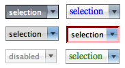
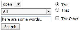
Single select boxes were the most problematic. How do you fuse the aqua pill-like control with a CSS background or border color? I think the answer is: You don’t. I decided to abandon Aqua for my own hand-rolled look which hopefully is Mac-like enough to blend with the other controls, but flexible enough to look good when CSS styles are applied.

The look for the select box is created with semi-transparent PNG images that allow the background color to show through. You’ll notice the widget also respects your choice of either the Blue or Graphite OS theme. Here’s a build off the Firefox 1.8 branch with the new Mac widget styles. Check it out and let me know what you think.

Download: ff-kmgerich-2006-03-11.dmg.gz, 9 MB

If you want a less experimental build of Firefox with native looking form widgets, check out Neil Lee’s G4 and G5 optimized builds.

Thunderbird's Extreme Mac-over

Thunderbird theme before and after

After the Pinstripe theme landed in Firebird, icon designer Stephen Horlander and I dove in to a companion Thunderbird theme. We started in early November 2003 and finally hit the “let’s stop fiddling with it and get it out there” phase in March of 2004. I’ve gone through the messages that Stephen and I exchanged during that time and pulled out a few examples of design decisions.
Continue reading “Thunderbird's Extreme Mac-over”

Find Bar Feng Shui

findbar-new.png

I have always thought the UI for Firefox’s Find Toolbar has room for improvement. Recently the Match Case checkbox was added to the bar, increasing the amount of horizontal space it requires. This becomes a problem when the find bar is used in the Help window, where a portion is clipped off unless you widen the window.

I made a Photoshop mockup of how an alternate find toolbar might look. This probably isn’t *the answer* – just starting point for a discussion. What do you like and dislike about the find toolbar, and what should we do about it?

Pretty Widgets, Part 2

widgets2.png

Here’s a followup on my attempt to make the HTML widgets on Mac Firefox presentable. I’ve had to make some compromises here to get the widgets to look nice, for instance I force the background-color and -image on buttons. And text box borders usually use my colors rather than the ones specified by the web page CSS. For these reasons these styles would probably not be acceptable for inclusion in Firefox, but in most cases I’ve found these to be more comfortable than the primitive default widgets.

Instructions: Close Firefox. Right-click on your Firefox application, choose “Show Package Contents”, and then open the Contents > MacOS > res folder. Make a backup copy of your platform-forms.css file. Then copy these files into the res folder:

Important: If you followed my instructions in the previous blog post to modify your userContent.css file, either delete it or remove my additional code before trying out the new and improved widgets.

A little bug: I’m not sure how I can get rid of the black border around the inside of the selected select box. Please let me know if you have any comments or suggestions for improvements!

Pretty Widgets

Inspired by Jon’s attempt to make Mac Firefox HTML form widgets a little easier on the eyes, I’ve taken a shot at making a set of widget styles that blends with Mac Firefox. It has focus rings too!

widgets.png

Instructions: Download the userContent.css file and copy it to your ~/Library/Application Support/Firefox/Profiles/(profile name)/chrome folder. Or add the code within to your existing userContent.css file. It’ll look best on a recent Firefox branch build.

The Browser, Redesigned: Take Two (or 0.2)

 
winstripe 0.2 toolbar

[ This post is by Stephen Horlander, the designer behind the majority of the Firefox icons. – Kevin ]

After the release of “Winstripe” into the wild there was a large and varied response. Ranging from mindless petulant rants and demands, to well thought out critiques. Lets just say there were more of the former than the latter. Even before it’s inclusion in Firefox I was personally less than thrilled about how it turned out. The idea, as you may have read, was to take the icons from Pinstripe and make them fit into a Windows environment. The theory was sound as the icon concepts used in Pinstripe were, I feel, fairly strong. Due to time constraints and my own admittedly limited familiarity with more recent incarnations of Windows I think they failed on this count. They do however work well enough and are a good deal better than most of the icons used by many Windows applications, in my biased opinion anyway : )

Continue reading “The Browser, Redesigned: Take Two (or 0.2)”

From the lab: Pinstripe theme tab redesign

After seeing Panther’s new tab controls, I thought it was time to redesign Pinstripe’s browser tabs. I want to make the tabs less visually disturbing than the Aqua tabs while being usable and polished. Here’s what I have so far. Click on the thumbnail below to view the whole image. Please comment on the design and suggest changes. Bonus points if you create a mockup of how you think it should look!

P.S.: The screenshot is of the beta of Pinstripe 3 on Mozilla Firebird with the SmoothStripes theme. I don’t use OS themes myself but I plan to make the next version of Pinstripe more theme-friendly.